3 SharePoint Site Design Best Practices for Beginners

Microsoft SharePoint Modern Sites easily allow you to publish news, share information necessary for your team or department, build up a community or show, and promote important solutions within your company. But what’s required to create sites where your employees love to work? The following three SharePoint site design tips will help you make your sites as interesting as possible:
- Decide what to show on the site
- Use visuals whenever possible
- Get in touch with Hub Sites

1. Decide What to Show on the Site
The first thing is to determine the purpose of the site and what you want to place on it. Some common SharePoint site examples include…
Intranet Landing Pages
For a SharePoint intranet landing page, I would recommend using a modern SharePoint communication site. This site should be the place where your employees get news about the organization, quick links to all important resources, and maybe even some personalized content.
Web parts that will help to achieve this are:
- News web parts
- Quick Links
- Weather
- Recent documents used
- Yammer Feed
- Twitter Feed
- Microsoft 365 (Office 365) Videos
Team Sites or Department Sites
The purpose of a Team or Department Site is to boost collaboration. That means you should provide all files that are important for the group, statistics depending on your team’s work, information about events that move closer, and perhaps some Team-related news that’s not significant to the whole organization.
Web Parts that will help you with this are:
- News Web Part
- Recent documents Web Part
- PowerBi integration
- Events Web Part
- Highlighted content
Migrate to Microsoft 365 or SharePoint with minimal business disruption.
Explore AvePoint Fly
Solution Sites
We all know the thousands of lunch menu apps, e-learning platforms or time tracking solutions that were built in SharePoint, but where should you put them? One option is to build a Solution Site. For example, in an E-Learning Site you can provide fun Microsoft Stream Learning Movies, Quick Links to advanced learning material, and so on.
Here are some Web Parts commonly used to build E-Learning Solutions Sites:
- Microsoft 365 (Office 365) Video
- News Web Part
- Quick Links
- YouTube
2. Use Visuals When Possible in Your SharePoint Design
Corporate identity is important, but visuals are more important. There are several reasons to use visuals instead of too much text.
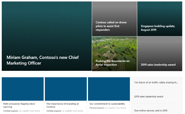
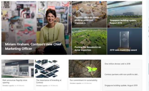
The average reader’s attention span on one page is limited to about 15 seconds, so it’s essential to include meaningful pictures or icons behind and next to content that you like to promote. It also simply looks more beautiful and motivates your employees to stay on the site and utilize it.
See the difference between these two sites:
| Less Visuals
|
More Visuals
|
3. Get in Touch with Hub Sites
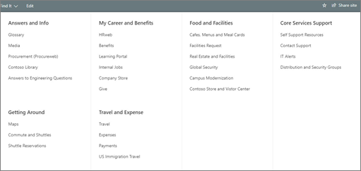
If you don’t know the Hub site features in SharePoint Online, it’s time to get used to it. SharePoint hub sites help you meet the navigational structures of your organization by connecting sites based on divisions and departments. This way, it’s easy to generate a more user-friendly navigation to the different Hub Member Sites. You can also easily aggregate news from all sites and inherit navigation and branding.

Now you know the drill, think about the purpose, use as many visuals as possible, and start to hubify SharePoint Online Site Collections. In my next post, I’ll show you how your SharePoint sites stay performant after using so many pictures. Stay tuned!


