User Centered Design: Reflections on Designing for DocAve Governance Automation Service Pack 2

As we live in a fast-paced digital era, we are surrounded with numerous applications and much advanced technology. Reflect back: Have you ever interacted with a new product that was hard to use and/or did not meet your needs? Have you experienced the sensation of insecurity that you were not in control over the features of a system that you were attempting to use? When reflecting, how did it make you feel? Confused, embarrassed, uncomfortable, frustrated, or angry? This post will describe why user centered design is important, and how we designed DocAve Governance Automation Service Pack (SP) 2 for a cohesive, immersive, and desirable end-user experience based on a holistic consideration of the user.
Why is User Experience (UX) Important?
A good UX is a win/win situation for both the user and provider. A successful product has several key characteristics that include but are not limited to: · Easy for the user to both learn and use · Helps the user to achieve his or her goals in the most efficient and effective way possible · Gives the user inspiration by displaying true value · Is pleasurable in the user’s hands and visually pleasing · Allows the user to identify him or herself with the product · Makes the user feel good, confident, and in control From a provider’s perspective, a successful UX achieves customer satisfaction and builds customer loyalty, which can have an even greater impact than providing individual features and functions. The reality is: Ease of use equals use. Complex and hard-to-use features simply don’t get used. Providing a good UX ensures that the customer gets a return on the investment and generates significant value for his or her organization. What is UX and How to Design a Good One? According to the User Experience Professionals Association (UXPA), user experience refers to “every aspect of the user’s interaction with a product, service, or company that make up the user’s perceptions of the whole. User experience design as a discipline is concerned with all the elements that together make up that interface, including layout, visual design, text, brand, sound, and interaction.” Since UX is subjective, context-based, and dynamic, designing for a positive UX is both an art and science-based methodology based on comprehensive understanding of user personas, goals, emotions, perceptions, preferences, physical behaviors, and psychological responses before, during, and after interacting with the system. As a subset of user experience, usability is the ease of use and learnability of the product. Steve Krug described the first law of usability as “Don’t make me think,” which refers to the fact that the application should be self-evident, obvious, and self-explanatory to the user. Peter Morville summarized the seven keys of a good UX as: · Useful · Usable · Desirable · Findable · Accessible · Credible · Valuable In order to ensure that the product is easy and satisfactory to use, it is crucial to target the user’s goals and intentions, think from user’s perspective, use the language that the user is familiar with, and guide the user to achieve goals smoothly and pleasantly. Designing UX for DocAve Governance Automation DocAve Governance Automation allows organizations to provide Microsoft SharePoint management as a service to business users. The target user spectrum for the product ranges from the business user, to the power user, to the IT administrator. The goal is to guide all users to reach their goals efficiently and effectively by making the UX similar to a friendly conversation, and focusing on designing for a fast, fluid, streamlined, cohesive, and immersive experience rather than simply individual features. Below is our methodology and some examples: 1. Simplify, simplify, and simplify. Less is more! As Antoine de Saint-Exupéry said, “A designer knows he has achieved perfection not when there is nothing more to add, but when there is nothing left to take away.” Even the most sophisticated user just wants to get his or her task done in as easily and quickly as possible. By simplifying, we nail down the basics and eliminate the unnecessary so that the necessary may speak better, and we engage the user to focus on the core content and task. We achieve true simplicity through elimination of distraction, thoughtful reduction, intelligent grouping, and categorizing. We prioritize the information visually by displaying the crucial information by default while hiding the less important information. · Content before chrome: Instead of using the static left navigation pane, we designed a new dynamic, interactive, and scalable top navigation. The pane slides out when the user clicks “Menu” on the top bar and collapses back when the user clicks anywhere outside of the pane. In this way, the user is more engaged and focused on the content.
Figure 1: Governance Automation SP2 landing page for IT administrators with the top navigation panel expanded. · We created dynamic tiles as the main navigational system. The user can read detailed descriptions for each section when hovering over the tiles and is then directed to the particular section when clicking the correspondent tile.

Figure 2: DocAve Governance Automation SP2 landing page for IT administrators. · We utilized a ribbon-based interface in the former version DocAve Governance Automation for placing the actionable command items. After thorough research and reflection based on user feedback, we decided to replace the ribbon with a tool bar in order to bring actionable commands closer to the content, establish a more intuitive layout, and use the space on the screen more effectively. All the actionable items are dynamic and context-based as we only display the available ones based on the user’s interaction while hiding the unavailable ones.
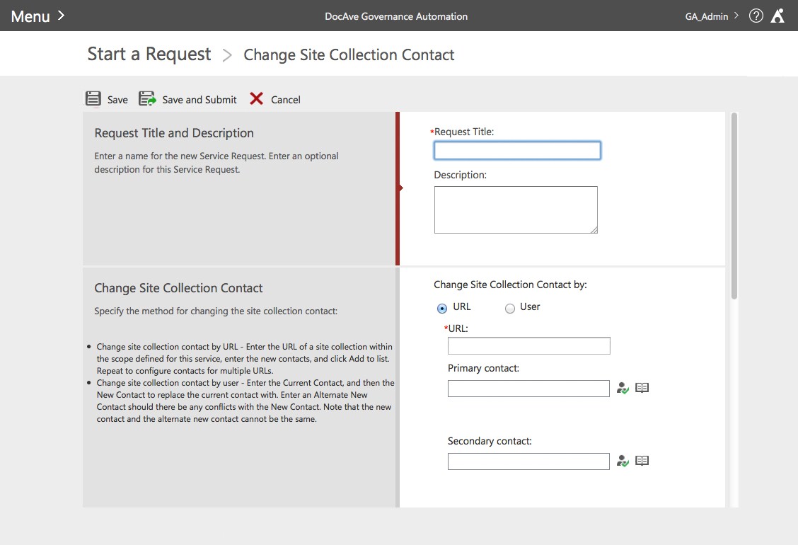
Figure 3: Start a Request – Change Site Collection Contact Service form page in Governance Automation SP2
2. We organized and grouped the information into categories in a more intelligent way so the user can easily understand the structure and logic of the information in order to make better decisions. We labeled categories in a way that supports easy navigation and findability. For example, we categorized the request items into logistic types and represent them via easy and intuitive navigation for natural flow as shown in Figure 4. We also categorized the filter into three groups: “basic filter”, “advanced filter”, and “filter by expiration date” as shown in Figure 5. Finally, we grouped the information in the “view details” pop up window as shown in Figure 6.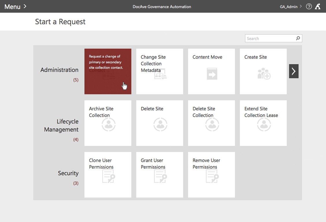
Figure 4: Start a Request page
 Figure 5: Site Collection Directory page with set filter panel expanded
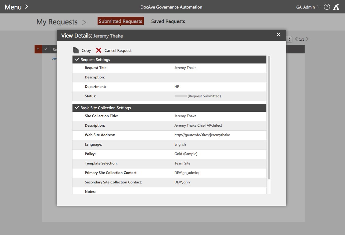
Figure 6: View Details pop up window for Submitted Requests section 3. Provide the user with clear, direct feedback and valuable information to assist him or her in achieving goals efficiently and pleasantly. · For the user to absorb information quickly in an intuitive and visual way, we not only use graphical colored bar to present the “Status” – such as using green for “Passed” and red for “Failed” – but also present detailed information of the steps in approval process as seen in Figure 7. For example, we use one fourth of the green bar to present that the first approver approved the request. The user can then drill down to view more detail when he or she hovers over the status bar.
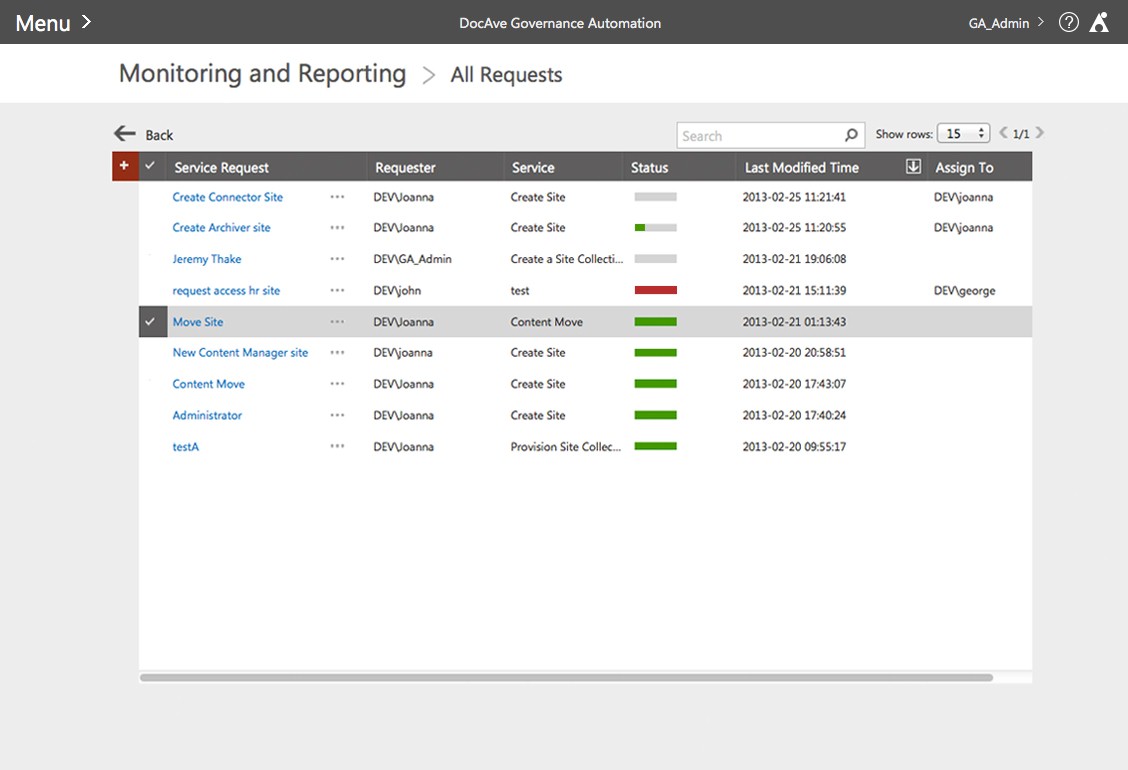 Figure 7: All Requests page in Monitoring and Reporting
· In the filter pop up window for the site collection directory page as shown in Figure 5, we provide the user the list of the items he or she selected in the dropdown box directly above, making it easy to keep track of selections so that he or she can make decisions accordingly.
· We display valuable information, such as the number of pending requests, as links in the entry point of the product, which is a landing page for the user to quickly access the pending request page as shown in Figure 1.
· We added a “*” for all the mandatory fields so that the requirement fields are clear and direct to the user.
· In the “Add Mapping” pop up window, we provide a pop up message box to explain what the actionable command means in a direct, graphical way when the user hovers over the arrow button as seen in Figure 8.
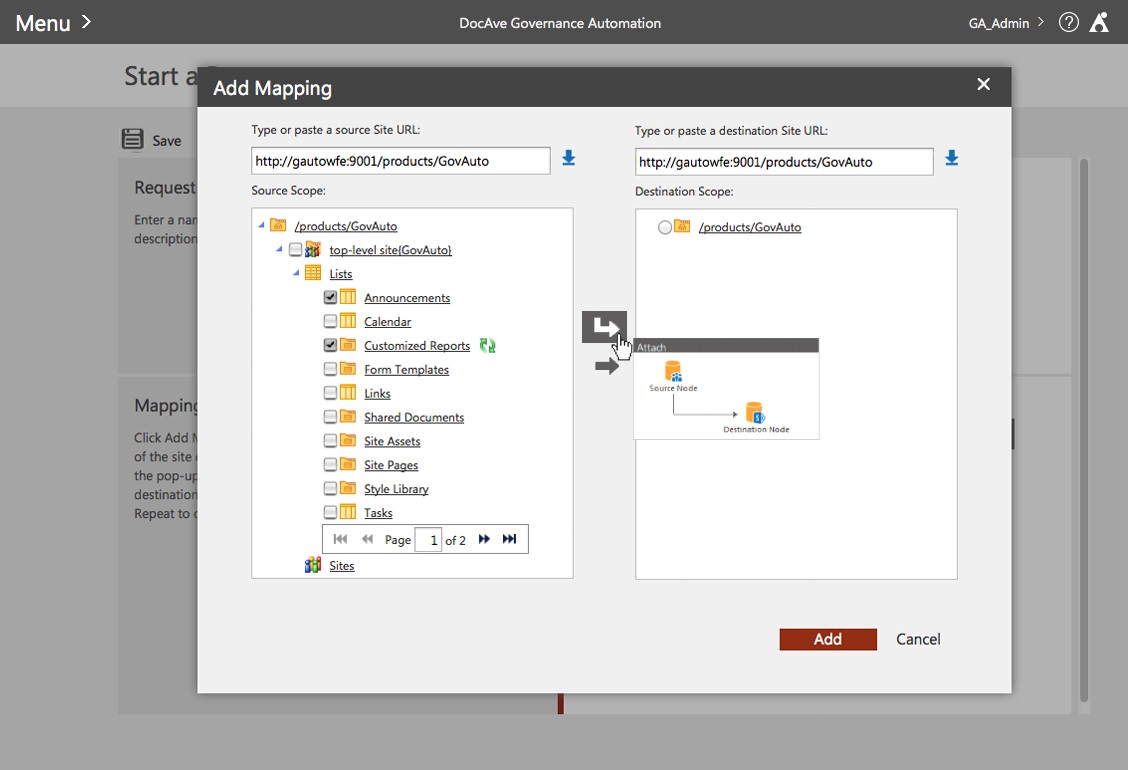
Figure 8: Add Mapping pop up window
4. Design an aesthetically pleasing look and feel. Attractive things work better! Aesthetics play a crucial role in shaping how we come to know, feel, and respond. They are concerned with how we perceive and interpret the world, and because of that, design choices influence understanding, emotions, and behavior. This is not simply about “styling” or “skinning”. How we think is closely related and associated with how we feel. As Frank Lloyd Wright stated, “Form and function should be one, joined in a spiritual union.”
The style direction of the Governance Automation user interface is simple, clean, inviting, contemporary, and polished. Not only do we make sure that we use consistent visual language throughout the product, but also design in a versatile way to ensure that the product works great either as a standalone tool or as a web part in SharePoint. We strive to create a holistic, consistent, and immersive experience throughout the various platforms. We pay close attention to details and aim to design a pixel perfect user interface.
5. Allow our brand to shine. We bring the prestige and recognition of our brand into the user interface via the usage of visual language. For example, color schemes, graphics, grids, layouts, and styles all work together in harmony so that we express and enhance our brand. We also establish product personality and credibility to win the user’s trust and build customer loyalty.
Final Thought
Many thanks to the close collaboration, great effort, hard work, and feedback from the entire AvePoint Team in making DocAve Governance Automation SP2 happen. All of us look forward to continuing to design for a cohesive, immersive, and desirable user experience with intuitive, easy to use, and inviting user interfaces so that we can continue to provide our customers with products that deliver maximum value.
